Investing 101: Market indices and the S&P 500.
If you haven’t read the Investing 101 series yet, I recommend starting from the beginning. In several previous articles, I discussed the S&P 500. In fact, if you do any reading about investing at all, you’ll find that references to the S&P 500 are ubiquitous. You might have heard advice telling you to invest in S&P 500 index funds. I’ve written articles on this blog comparing investments, such as real estate, to the S&P 500. For investors, talking about the S&P 500 is almost second nature. But what exactly is the S&P 500?
The S&P 500 is a stock market index
The performance of any particular company can be easily tracked by looking at its share price. To continue from the previous article, let’s use Microsoft again. On January 2, 2020, which was the first trading day of 2020, Microsoft closed with a share price of $158.57. One year later, on January 4, 2021, the first trading day of 2021, Microsoft closed with a share price of $217.19. So Microsoft’s valuation increased by about 35% in one year. Remember that valuations of public companies, and therefore their share prices, reflect the consensus of millions of participants in the free market. It’s very easy to look at any company’s share price over time and see how it is doing.
But Microsoft is just one company, and its performance might be quite different from that of other software/tech companies, or the overall market. Some companies grew by more than 35% in 2020, but most companies did not. How did the overall market perform? How do you track the aggregate performance of hundreds or thousands of companies at once? The answer is a market index.
A market index is basically a single number that can be used to summarize the performance of a sector of the market, or the entire market itself. In any given market, there are hundreds, if not thousands, of companies, each with different individual performance. A market index basically gives us the “big picture” or the “class average”, if you will.
But if you just go around and average the share price of all the companies in the market, you might not get a very useful result. There are many different ways to go about constructing a market index, but the method used makes a big difference.
Two of the most well known market indices for the U.S. domestic stock market are the Dow Jones Industrial Average (DIJA, often just referred to as the Dow) and the Standard & Poor’s 500, or S&P 500. The Dow is the oldest stock market index, which helps explain its enduring popularity. The S&P 500, however, is actually the better indicator of overall market performance. This is because the Dow is a price-weighted index whereas the S&P 500 is a cap-weighted index. Therefore, the Dow and S&P 500 have fundamentally different constructions. To see the difference, we’ll use a hypothetical example with exaggerated numbers.
The hypothetical market
Assume that there is a small island whose economy consists solely of tourism, and that there are only two tourism companies on the entire island. Company A is the much larger company; it owns 100 boats, does hundreds of tours per year, earns $10,000 in profits per year, and after all appropriate fundamental analysis calculations, it has a market valuation, or market capitalization, of $100,000. Company B is about 100 times smaller; it owns 1 boat, does just a few tours per year, earns $100 in profits per year, and it has a market valuation of $1,000.
Let’s also assume that Company A has 100,000 shares of stock outstanding, so each share represents 1/100,000th of the company. The share price of company A stock is therefore $1. Company B, on the other hand, only has 10 shares of stock outstanding. This means that each share of company B stock represents 1/10th of the company. The share price of company B stock is therefore $100.

It’s clear that the total tourism industry is worth $101,000 and company A represents the lion’s share of this industry. How do we construct an index that accurately captures the overall tourism industry on this island? First, let’s see what a price-weighted index might look like.
The price-weighted index
A price-weighted index finds the average share price of all the companies in the index. It might look like the following:
Index = (company A share price + company B share price + …..) / (total number of companies)
We simply take the average of the share price of company A stock and company B stock. Since a share of company A costs $1 and a share of company B costs $100, we declare that the island tourism stock index is currently (100 + 1)/2 = 50.5.
This is essentially the method used by the Dow Jones Industrial Average. It sums the share prices of 30 large companies in the United States and divides this sum by a number. One common criticism of a price-weighted index is that it does not take into account the company’s relative size or impact; only its share price matters. And as we can see, share price has nothing to do with how large or influential a company might be. A small company can have very high-priced shares if there are few total shares such that each share represents a large proportion of ownership.
Going back to our island example, let’s imagine that company B’s only boat breaks down and needs expensive repairs. It also can’t generate profits from tours anymore until the boat is repaired. The market reacts to this news and now values company B at only $500, down from $1,000. This means that each share of company B stock is now worth $50. Meanwhile, company A with its 100 boats continues to conduct its business unaffected.
What happens to the price-weighted tourism index? The new index value is calculated at (50 + 1)/2 = 25.5. The index suggests that the island tourism industry has declined greatly! But in reality, since company A does 99% of the tourism on the island, the island’s overall tourism industry was barely affected.

Example of a hypothetical price-weighted index. The Dow Jones Industrial Average is a real price-weighted index.
The cap-weighted index
The cap-weighted index doesn’t care about share price in a vacuum. Instead, each company’s contribution to the index is weighed in proportion to its market capitalization. Therefore, since company A is 100 times larger than company B, movement of company A’s share price affects the index price calculation 100 times more. A hypothetical cap-weighted index might be calculated as follows:
Index = (company A market cap + company B market cap + ……) / 2000
The divisor can be any arbitrary number, but using a divisor of 2,000, we get an index value of (100,000 + 1,000)/2000 = 50.5. This gives us the same index value as our previous price-weighted index.
Except now, in the example where company B’s boat broke and its valuation dropped to $500, the new cap-weighted tourism index value is (100,000 + 500)/2000 = 50.25. As you can see, company B’s misfortunes did affect the index slightly, but the index correctly suggests that the island’s overall tourism industry was not significantly impacted.
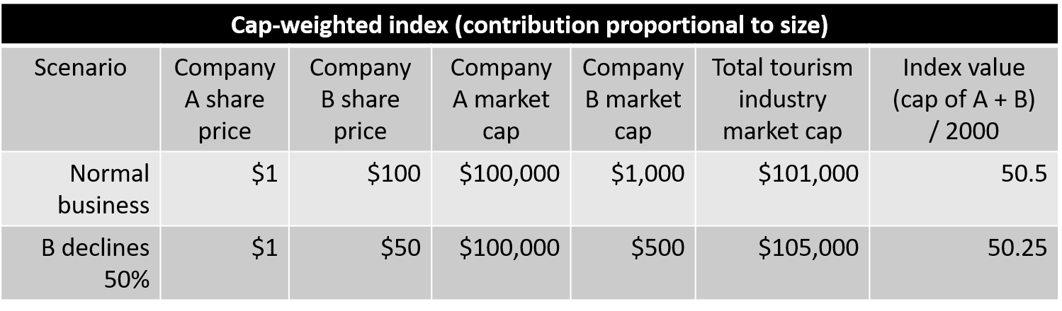
A hypothetical cap-weighted index. The S&P 500 is a real cap-weighted index.
The Dow Jones Industrial Average
Hopefully, all of that made sense. In real life, the Dow is a price-weighted index calculated using the share price of 30 large companies. You can easily look up the list of 30 companies on the internet. It is commonly followed due to its longevity (it was one of the first ever stock market indices to be published in the United States). However, most people feel that it is not a good representation of the overall U.S. stock market for two main reasons: it only includes 30 companies, and it is calculated using share prices of those 30 companies. As we’ve already seen, a company’s share price has nothing to do with a company’s size or relative contribution to the economy. Even small companies can have high share prices if the company’s stock doesn’t have very many shares in the first place.
For example, Goldman Sachs (GS) is one of the 30 companies that comprises the Dow. As of April 2021, it has a share price of about $340, and a total market cap of about $117 billion dollars. Cisco systems (CSCO) is another one of the 30 companies on the Dow. As of April 2021, it has a share price of about $50, and a market cap of about $220 billion dollars. However, because the Dow is price-weighted, Goldman Sachs contributes 7x more to the calculation of the Dow than Cisco systems, despite being a company with 1/2 the market cap. This is analogous (although less exaggerated) than the scenario of company B contributing 10x more to the calculation of our price-weighted island tourism index despite being 100x smaller than company A.
This is not meant to cast any aspersions on Goldman Sachs, but merely to illustrate that in a price-weighted index such as the Dow, a small company with a high share price can have disproportionate contribution to the calculation of the index. Therefore, most industry professionals do not feel that the Dow is a good representation of the U.S. stock market as a whole.
The S&P 500
On the other hand, the S&P 500 is a cap-weighted index calculated with 500 of the largest companies in the United States. Many of these companies are household names, such as Amazon, Apple, Boeing, Coca-Cola, Google, Ford, etc. You can find a full list of all 500 companies here. Because the S&P 500 includes so many companies, and because each company’s contribution to the S&P 500 is proportional to their market cap, the S&P 500 ends up being a great representation of how these 500 companies are performing in aggregate.
Furthermore, the S&P 500 companies comprise of about 80% of the total US stock market by market capitalization. This means that although the S&P 500 only has 500 companies (whereas the total US market has about 4,000), the combined valuation of the S&P 500 companies represents the vast majority of the U.S. stock market as whole. Therefore, short of a total market index (where every company is included in the calculations), the S&P 500 is an incredibly accurate representation of the overall U.S. stock market. In fact, the correlation between the S&P 500 and the actual total U.S. stock market is usually in excess of 99%. For this reason, the S&P 500 is the most closely-watched market index in the world, and the performance of the S&P 500 is used as a proxy for the performance of the entire U.S. stock market.
So how has the S&P 500 performed over time? As it turns out, American companies, in aggregate, have been extremely profitable and have provided tremendous returns to investors. Throughout its history, the S&P 500 has returned around 9 to 10% compound annual growth rate (CAGR) to investors, when dividends are reinvested. If you are unfamiliar with CAGR, I have an article on CAGR which goes into more detail.
The following charts provide a visual representation of the S&P 500 index price over the past 95 years or so. For decades, companies have been making profits hand over fist, and the aggregate value of these companies has increased without equal. Unlike some speculative asset classes, the S&P 500 is comprised of real companies that make real profits. The S&P 500 represents the ingenuity and productivity of the U.S. market economy and reflects ever-rising U.S. prosperity. If there is one thing we’re good at, its making money. Capitalism works and the proof is in our economic superpower status. And the best part is that anybody can come along for the ride.

In fact, these charts need to be updated, because in 2021, the S&P 500 broke a new milestone of 4,000. I discussed this in one of my recent articles. The exponential nature of compound growth is clearly on display, although recent stock market crashes, including the 2000 dot-com crash, the 2007 global financial crisis, and the 2020 COVID-related market crash are still clearly visible.
With any kind of compound growth curve, the more recent growth looks exaggerated and unsustainable. So I also like to include the following chart, which shows the same S&P 500 over time, except with a logarithmic Y axis. This illustrates that the S&P 500 has, more or less, been growing at a steady pace for the past 90 years.

Of course, this is not to say that the stock market can’t crash or isn’t volatile. In fact, historically we’ve had a severe market downturn about once every decade, and many people believe that another downturn is imminent. And sometimes it has taken over 10 years to recover from a crash. But short-term fluctuations aside, in the long run, the U.S. stock market has never failed to provide returns to investors. This is why when it comes to retirement investing, where your time horizon is 20, 30, or even 40 years, the stock market is the benchmark to which everything else is compared. You’ll find plenty of references on my blog saying that the stock market has provided 9 to 10% annual returns in the past. That’s because it’s true. The following table shows S&P 500 annualized returns by decade:
| Decade | Annualized Returns (CAGR) | CAGR after inflation |
|---|---|---|
| 1930s | -0.05% | 2.10% |
| 1940s | 9.17% | 3.45% |
| 1950s | 19.35% | 16.94% |
| 1960s | 7.81% | 5.37% |
| 1970s | 5.86% | -1.12% |
| 1980s | 17.55% | 11.42% |
| 1990s | 18.21% | 14.77% |
| 2000s | -0.95% | -3.42% |
| 2010s | 13.56% | 11.58% |
| Total (1930 - 2019) | 9.82% | 6.57% |
The new decade (2020s) is still in its infancy. But in 2020, the S&P 500 returned 18.4%, and thus far in 2021 (early May), the S&P 500 is up about 11% on the year.
For some context, (and in case you forgot the power of compound growth), a one-time, $10,000 investment in 1930 would be worth $45,733,531.31 ($45.7 million) by the end of 2019, and approximately $60 million today. That’s the power of 9 to 10% annual growth for 90 years.
You can find plenty of data online about the historic performance of the S&P 500, as well as calculators to show what your investment returns would have been over any historical time period. A lot of this information is also in my book, so I won’t belabor it further here.
How do I invest in the S&P 500?
In this article, we covered what a market index is, two different ways that market indices are calculated, and looked at two market indices for the U.S. stock market, the Dow and the S&P 500. Throughout the first 4 articles of the Investing 101 series, we haven’t covered any actual investing. This is because I believe it is important to understand what are you investing in, rather than just blindly following somebody’s advice to buy S&P 500 index funds without even knowing what stocks are, what the S&P 500 represents, or what an index fund is.
I mentioned in the very first Investing 101 article that investing in the S&P 500 is easier than ordering pizza. This is not an exaggeration. One technical nitpick is that you cannot invest in the S&P 500 directly per se, because its just a market index calculated from 500 companies. But you can mirror the returns of the S&P 500 by investing in those 500 companies in the same proportions as they are represented in the S&P 500 index. This might be a tedious endeavor if you tried to do it individually, but thankfully, it is basically what an S&P 500 index fund does for you. So finally, after four articles of theory, we get to dive into some actual financial products. But before we start talking about funds, we first need to look at the practice of picking stocks. That will be the topic of the next Investing 101 article: Part 5: Picking stocks (and why it’s a bad idea).
Happy investing!
Bonus:
At the end of the previous article I challenged the reader to find the following by simply looking up basic stock tickers:
A massive company (above $1 trillion in market capitalization)
Any profitable company (had a positive EPS in 2020)
A profitable company (positive EPS in 2020) that doesn’t pay any dividends
An unprofitable company (negative EPS in 2020) that paid dividends in 2020
There are many companies that fit each category. Here are my examples:
Microsoft (MSFT), the company I used in several examples, has a market cap well over $1 trillion.
Walmart (WMT) is one of thousands of companies which makes profit net of fees. In 2020, it had EPS of 4.75.
Facebook (FB) is also a profitable company, and one of the largest in the world by market cap. In 2020, it had EPS of 11.67. It has never paid a dividend.
AT&T (T) was not profitable in 2020, with EPS of -0.34. However, it still paid dividends in 2020. Its dividend yield is currently between 6 to 7%.